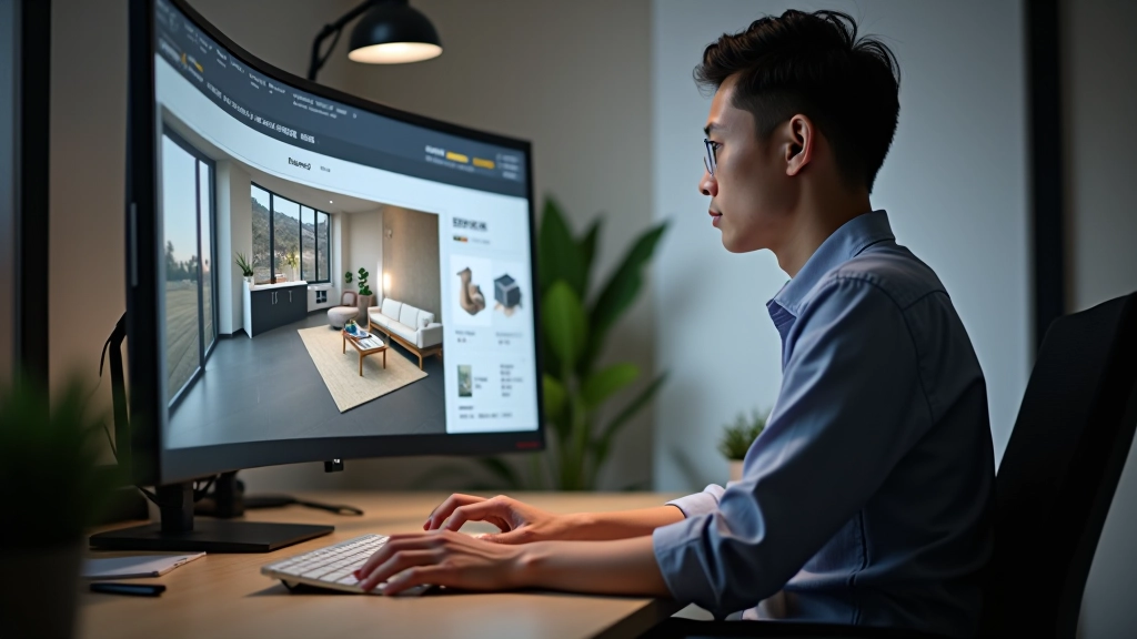
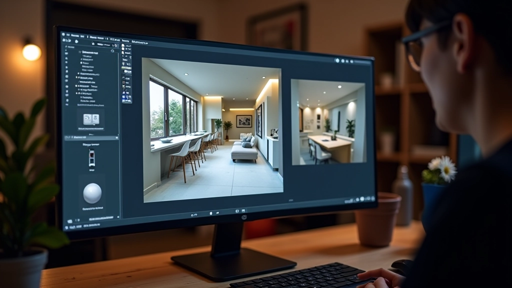
Getting Started with 3D Visualization Tools
Learn the fundamentals of 3D software and how to create realistic interior renders that bring your mood board concepts to life.
Learn how to curate materials and colors that communicate your design vision clearly to clients. A well-crafted mood board bridges the gap between your imagination and their understanding.
A mood board isn’t just pretty pictures pinned together. It’s a communication tool—a visual language that tells your clients exactly where you’re taking their space. When you’ve got the right materials, colors, and textures all in one place, clients can finally see what you’ve been imagining. They stop asking questions like “but what will it actually feel like?” and they start saying “yes, I see it now.”
The difference between a generic mood board and one that actually works comes down to strategy. You’re not collecting random beautiful things—you’re building a narrative about how a space will function, feel, and look over time. It’s the foundation of every project we teach here at our studio.
Colors don’t live in isolation. That soft gray you love? It’ll look completely different depending on what’s next to it. That’s why you can’t just grab five paint chips and call it done.
We recommend building your color palette with at least three layers: a dominant color (roughly 60% of the space), a secondary color (about 30%), and an accent color (the remaining 10%). Don’t rush this part. Spend time with actual material samples under different lighting conditions. A color that looks great in the showroom might feel off in your client’s north-facing living room.
This isn’t just theory. We’ve used this ratio on over 150 projects since 2018, and it consistently creates balanced, livable spaces. The math gives your clients confidence too—they can see you’ve thought this through systematically.
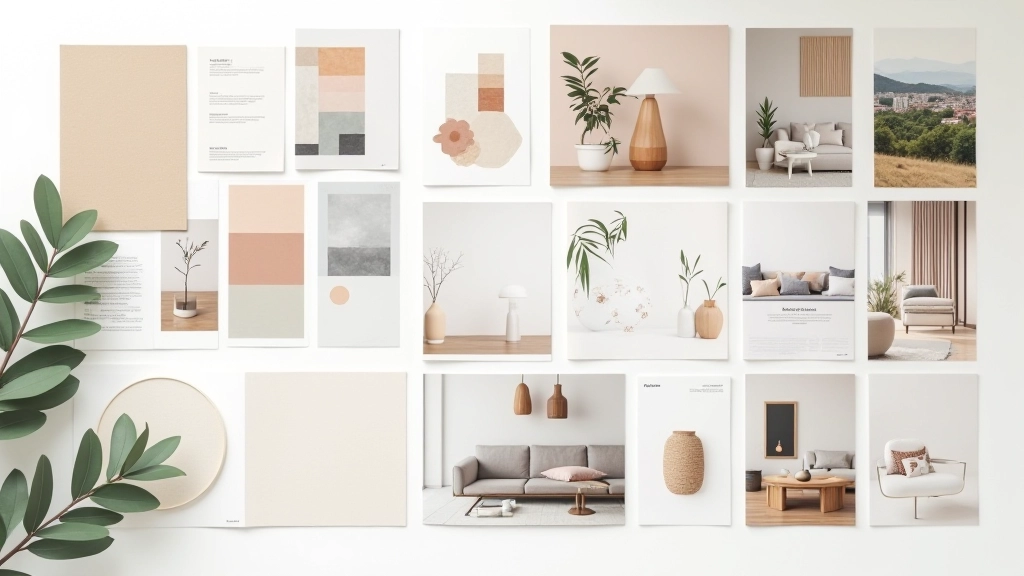
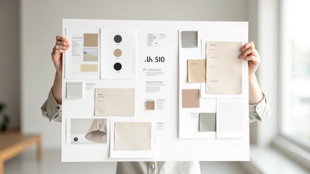
Here’s where mood boards separate from Pinterest inspiration collections. You’re not just showing images—you’re showing actual materials. Clients need to feel the weight of a fabric, see how wood grain catches light, understand how glossy versus matte finishes change a room’s energy.
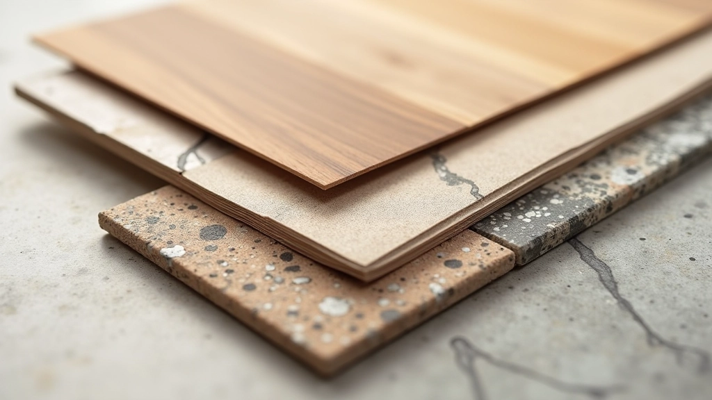
Include at least 8-12 material samples in your physical mood board. Wood finishes (minimum 2), upholstery (minimum 2), hard surfaces like stone or tile (minimum 2), paint or wallpaper (1-2), and lighting or metal accents (1-2). Each material tells part of your design story. A matte charcoal wall paired with a warm oak floor tells a completely different story than the same colors would if they were reversed or swapped for glossy finishes.
Don’t just grab whatever’s available at your supplier. Be selective. Your choices should justify themselves—that expensive linen matters because it’ll age beautifully, or that particular tile works because its undertones echo the paint you selected.
Building a mood board is straightforward once you know the method. We teach this sequence to every student, and it works whether you’re working in person or remotely.
Group materials by what they do: wall treatments at the top, flooring samples in the middle, furnishing and fabric options lower. Clients will intuitively understand how these layers build the space from the ground up. It tells a story of how the room actually works.
Don’t let one big bold color dominate the entire board. Distribute your accent colors and textures evenly. A mood board that’s 70% one color will make clients anxious—they’ll worry you’re pushing them too far in that direction. Balance creates confidence.
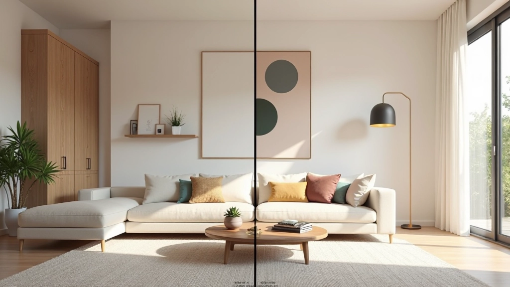
Include 2-3 carefully chosen reference images showing how these materials work together in real spaces. Not Pinterest inspiration—actual rooms that use the same color palette and material combinations you’ve selected. This is the bridge between abstract samples and the final result.
You can have the perfect color palette and materials, but if your mood board looks slapped together, clients won’t trust your vision. The presentation itself communicates your professionalism.
Mount everything cleanly on high-quality board stock (we use 3mm museum-quality board). Leave breathing room around each material sample—don’t cram everything in. Include printed labels identifying each material: the manufacturer name, product code, and finish (matte, gloss, textured, etc.). This detail work takes maybe 2-3 hours per board, but it’s what separates confident professionals from amateurs.
For digital presentations, the rules shift slightly. You’ll want higher resolution images, clear spacing between elements, and probably a 16:9 ratio that works on screens. But the principle stays the same: every choice you make should communicate intentionality and expertise.
We see this constantly. Designers get excited and include 7, 8, sometimes 10 different colors. Clients get confused. Stick to your 3-color system. Add neutrals if needed, but don’t add more chromatic colors.
A 4-inch fabric swatch looks completely different when it’s 40 square feet of upholstery. Show proportions. If a color will cover 60% of the room, show it covering 60% of your board.
Stock photos feel impersonal. Your clients want to see how YOUR materials work together, not how some designer’s materials worked in some other city. Choose references strategically.
This guide provides foundational techniques for mood board creation based on standard interior design practice. Results vary depending on client preferences, project scope, and individual designer approach. Always consider your specific project requirements and client needs when developing mood boards. Consult with experienced mentors or supervisors when working on client projects to ensure professional standards are met.

When you hand a client a well-crafted mood board, you’re making a promise. You’re saying: “I’ve thought about every color, every texture, every proportion. I understand your space and I know exactly how to make it work.” A weak mood board communicates the opposite—that you’re still figuring things out.
The techniques we’ve covered here aren’t complicated. They’re just systematic. Color layering, material selection, thoughtful presentation—these aren’t secrets. They’re the foundation of professional practice. Once you’ve done this 5-10 times, it becomes instinctive. You’ll start seeing spaces in terms of material relationships and color stories automatically.
Your mood board is where design thinking becomes visible. Make it count.